|
|
Post by Xuvatilavv on Jul 13, 2011 3:02:41 GMT -5
Back when I had a ten year old 15 inch 3:4 monitor, I used to see the sigs you make here and think "Dang, these sigs are all huge and unsightly and horrid. Why would they make them so big and disproportional?" Recently I got a new computer, accompanied with a classy 24 inch 16:9 HD monitor, I see the sigs now and think "Wow, these sigs are all tiny and minute and still disproportional. What's the deal?"
It made me curious, what size monitor/resolution do you have on your computer?
And on a side note, why are those sigs so darn disproportional?
|
|
|
|
Post by +wR.edenwax on Jul 13, 2011 3:56:45 GMT -5
They are meant to be small!
I've personally got 2 displays for my laptop, the built in 15.6inch 1366x733px display, and my 23inch 1920x1080px display.
|
|
|
|
Post by +wR.[Anthony] on Jul 14, 2011 2:17:24 GMT -5
disproportional? you want them to be squares or what?
|
|
|
|
Post by +wR.edenwax on Jul 14, 2011 3:36:42 GMT -5
Maybe hes got his resolution off?
|
|
|
|
Post by Xuvatilavv on Jul 14, 2011 7:37:40 GMT -5
The sigs here just seem a lot blockier than they should be. On my old monitor, it would end up with the sig being larger than most of the posts themselves, which made it a task to actually read through a thread. With my experiences of forums long past, the sigs usually ran closer to the full width of the post, giving more of a flush look to the whole forum in general. Though now that wR has become wS the Minimalist, the less wide sigs fit better.
|
|
|
|
Post by +wR.[Anthony] on Jul 25, 2011 2:46:26 GMT -5
The sigs here just seem a lot blockier than they should be. On my old monitor, it would end up with the sig being larger than most of the posts themselves, which made it a task to actually read through a thread. With my experiences of forums long past, the sigs usually ran closer to the full width of the post, giving more of a flush look to the whole forum in general. Though now that wR has become wS the Minimalist, the less wide sigs fit better. lolol what resolution were you using 800x600? You were probably still using Windows 95 lolol |
|
|
|
Post by lolwut? on Jul 25, 2011 2:50:33 GMT -5
The sigs here just seem a lot blockier than they should be. On my old monitor, it would end up with the sig being larger than most of the posts themselves, which made it a task to actually read through a thread. With my experiences of forums long past, the sigs usually ran closer to the full width of the post, giving more of a flush look to the whole forum in general. Though now that wR has become wS the Minimalist, the less wide sigs fit better. lolol what resolution were you using 800x600? You were probably still using Windows 95 lolol Fool probably had only 64 mb of ram on that old clunker! HIGHFIVE |
|
RUBiX
New Member

Posts: 28
|
Post by RUBiX on Jul 25, 2011 3:11:19 GMT -5
*highfive*
|
|
|
|
Post by +wR.edenwax on Jul 25, 2011 3:31:16 GMT -5
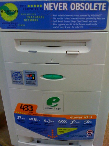
64mb? That's absurd! My computer only has 32mb and it runs 98 like a CHAMP. AND ITS NEVER OBSOLETE.  |
|
|
|
Post by +wR.[Anthony] on Jul 25, 2011 3:47:02 GMT -5
USB PORTS?! UNHEARD OF.
|
|
|
|
Post by Xuvatilavv on Aug 23, 2011 17:54:19 GMT -5
You need to upgrade that thing with a zip disk drive. 100mb storage per disk!
For clarity: it was XP at 1024x768. Not a bad machine, just was how it looked
|
|