|
|
Post by Jonathan on Jan 10, 2011 23:41:51 GMT -5
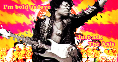
This was fun, semi used [Anthony]'s Star Wars Full Tag Tutorial, but once it started looking all trippy I couldn't put any more distortion on it.  |
|
|
|
Post by +wR.[Anthony] on Jan 11, 2011 0:37:38 GMT -5
I really dig this. Great job with the colors.
I think the only problem I have is the background, below the sun. I just can't tell what in the world that is. lol
|
|
|
|
Post by Jonathan on Jan 11, 2011 0:43:26 GMT -5
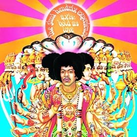
Thanks man! I love these colors too. Here's the original album cover. Think I should have left the faces? I kinda wanted the focus to be Jimi, so I just kept the ripple on the faces.  |
|
|
|
Post by +wR.[Anthony] on Jan 11, 2011 0:46:27 GMT -5
I would have blurred the faces maybe to increase depth?
But still cool either way!
|
|
|
|
Post by Jonathan on Jan 11, 2011 0:53:59 GMT -5
Ah, gotcha. Thanks for the tips dude! I've got to shake all my rust off!
|
|
|
|
Post by Sip on Jan 12, 2011 23:00:45 GMT -5
Nice signature man! I like them colors and the text!
|
|
|
|
Post by Jonathan on Jan 12, 2011 23:42:19 GMT -5
Thanks man! Yeah I actually enjoy this one.
|
|